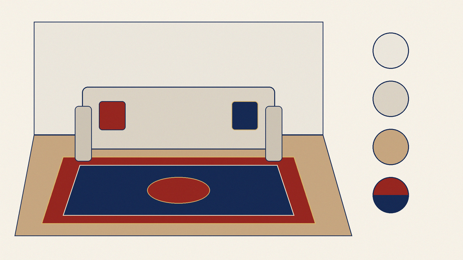
A Persian rug is often the largest single surface of colour and pattern in a room. Because it sits flat on the floor and catches both natural window light and evening lamp light, its palette shapes how warm, spacious, or grounded the entire interior feels 123. Choosing the right rug colour is much easier when you work from the fixed elements of your space rather than judging a rug swatch in isolation 23.
Start from What Stays: Floor, Walls, and Sofa
Unless you are renovating an empty shell, every room already has three large colour anchors that are expensive or difficult to change: the flooring, the walls, and the main sofa or seating group. A successful rug palette bridges these three layers:
The Floor Undertone: A rug always appears surrounded by a border of visible flooring. Warm honey oak, travertine, and terracotta floors have yellow-orange undertones that harmonize naturally with warm ivory, crimson, rust, or deep navy rugs 14. Cool grey porcelain tiles, pale ash timber, or polished concrete pair cleanly with slate grey, silver, cool ivory, or indigo-blue grounds, or can be intentionally warmed up with a rich madder-red carpet 14.
The Wall Colour: Walls establish the vertical background of the room. When walls and floors are both pale neutrals, a rug with a deeper ground colour anchors the furniture so the room does not feel weightless.
The Sofa and Large Upholstery: Because the front legs of sofas and armchairs usually rest directly on the rug, the rug’s main ground colour or secondary border and medallion tones should either contrast cleanly with the sofa fabric or repeat its undertone inside the pattern 4.
Daylight and Lamp Light: Why Room Lighting Changes Everything
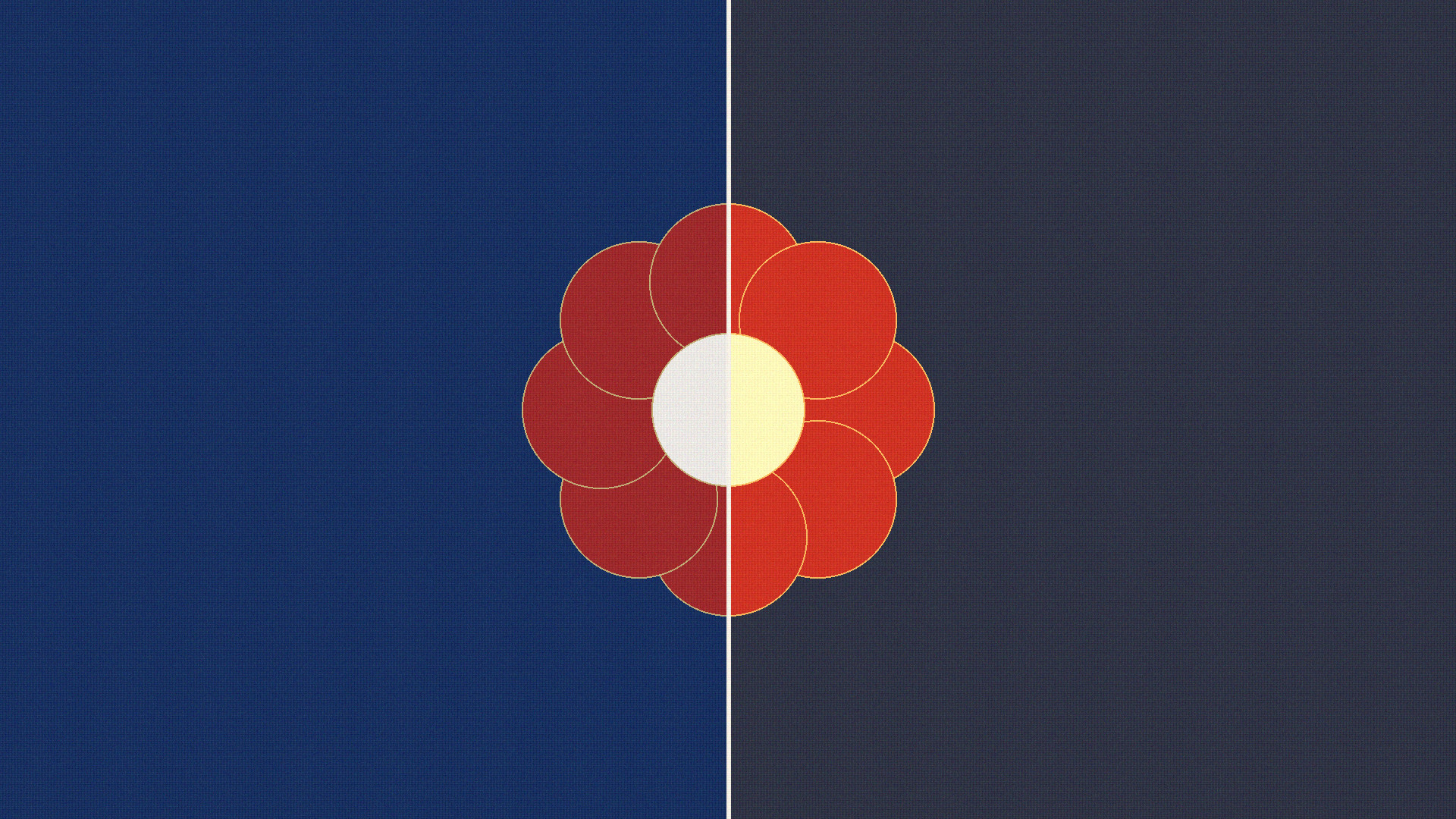
Colour is not a fixed property locked inside a dyed yarn; what the eye perceives depends on the light source illuminating the textile and the direction from which the pile is viewed 23.
Cool North Light vs. Warm South and West Sunlight: Rooms facing away from the sun receive cooler, bluish daylight that sharpens blues, greys, and cool ivories while muting reds and golds. Rooms flooded with direct afternoon sunlight amplify warm reds, terracottas, and golden beiges 3.
Evening Lamp Light: Warm household LED and incandescent lamps emit yellow-amber wavelengths. Under warm evening lighting, ivory grounds look creamier, navy blue deepens toward midnight black, and crimson or burgundy tones appear richer and warmer.
Pile Direction and Sheen: As documented by the Carpet and Rug Institute, cut-pile rugs—especially those woven with lustrous fibres—lean at a slight angle 2. Viewing the rug with the pile direction reflects more surface light and makes every colour look two to three shades lighter, whereas viewing into the pile makes the exact same colours appear darker and more saturated 2.
Classic Persian Palettes and How They Read in a Room
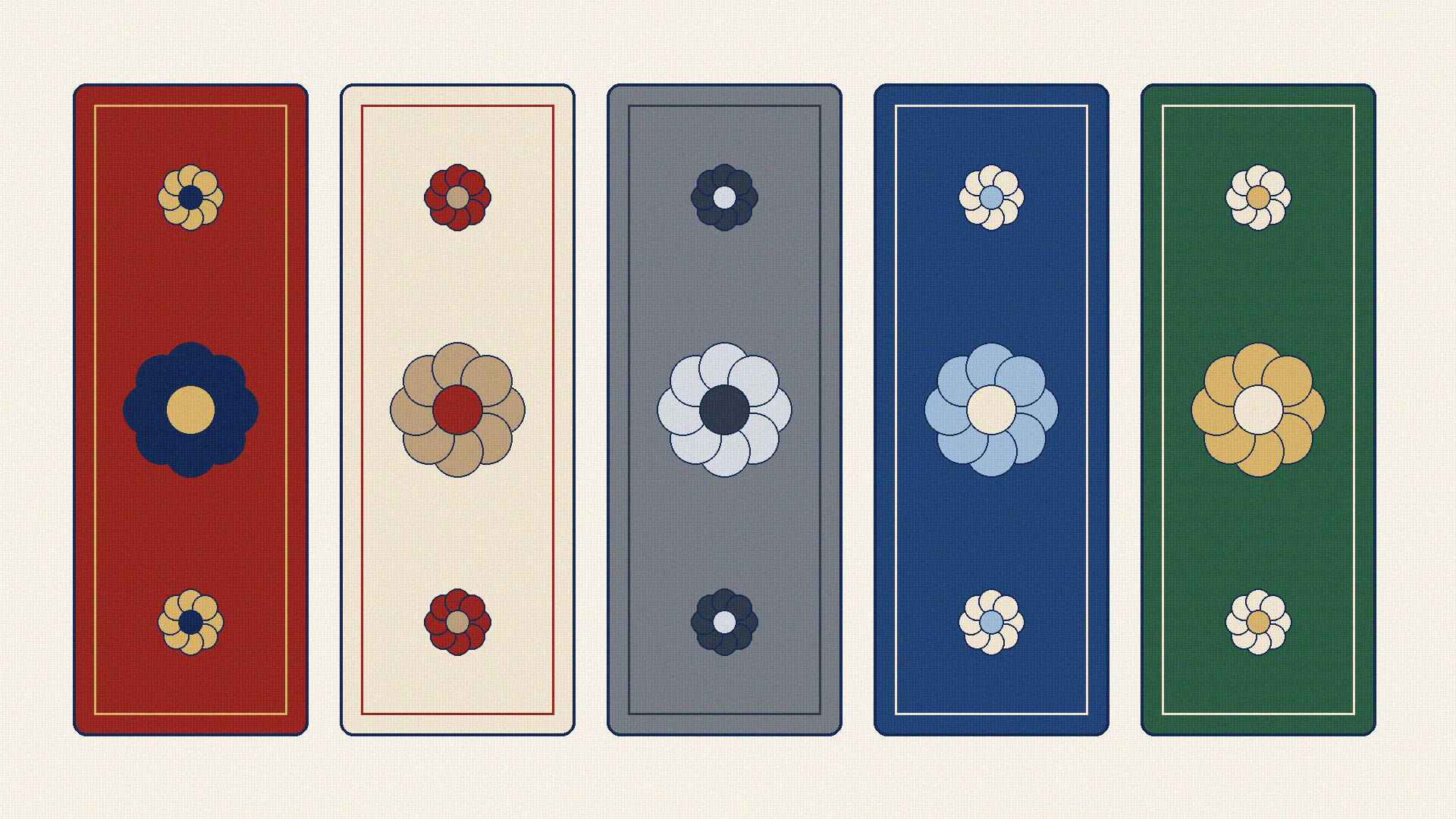
Traditional Iranian dyeing and weaving developed balanced colour combinations—historically rooted in madder root (runas), indigo (nil), walnut husks, pomegranate rind, weld, and natural wool tones—that remain the backbone of both hand-knotted and machine-made Persian rugs today 145:
Deep Red and Navy (Laki and Sormeh-i): The quintessential classical Persian pairing, exemplified by historic Kashan, Tabriz, and Mashhad carpets 145. A crimson or madder-red field with a navy medallion and border brings immediate warmth, formality, and visual energy to rooms with wood floors and neutral upholstery 4.
Warm Ivory, Cream, and Beige (Kerm and Biscuiti): Historically associated with Nain, Isfahan, and Qom palettes 4. Light grounds reflect light back into the room, making compact spaces or rooms with dark timber floors feel larger and brighter.
Grey, Silver, and Charcoal (Tusi and Noghreh-i): Widely used in contemporary neoclassical Persian rugs, pairing effortlessly with modern grey sofas, marble floors, and minimalist architecture while preserving traditional Shah Abbasi or Afshan floral drawing.
Indigo, Royal Blue, and Powder Blue (Lajvardi and Abi): Blue grounds offer calm, structured depth without the heat of crimson, working well in sunlit rooms, studies, and bedrooms 14.
Cypress Green and Olive (Sabz): Used either as a serene field colour or as a botanical accent in garden, tree, and hunting compositions 146.
Dark Grounds vs. Light Grounds
Choosing between a dark background (such as navy, crimson, or charcoal) and a light background (such as ivory, cream, or pale silver) changes both the visual weight and the practical maintenance of the room 234:
Dark Grounds: Anchor large rooms with high ceilings, create cosy intimacy, hide everyday dust and foot traffic in busy living and dining areas, and make pale sofas stand out crisply 34.
Light Grounds: Open up smaller rooms, brighten dark wood or dark tile floors, soften heavy leather or dark velvet furniture, and create an airy, calm atmosphere in bedrooms and formal lounges 23.
Matching vs. Contrast
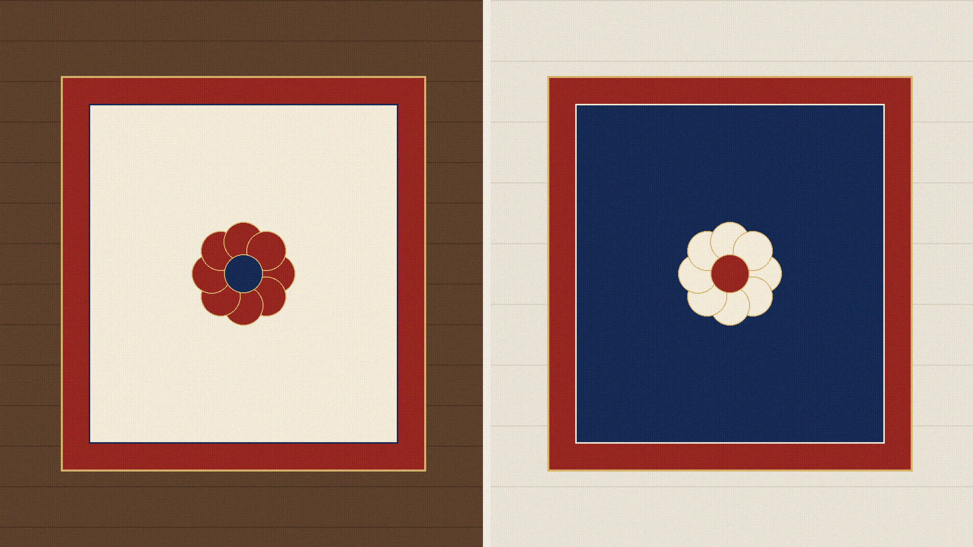
A common mistake is trying to match the main ground colour of a rug to the exact shade of the sofa or floor. When a beige sofa sits on a beige rug over a beige floor, the room loses visual boundaries and looks flat. Instead, aim for main-colour contrast paired with accent repetition 4:
If your sofa is warm beige or cream, place it on a navy, crimson, or slate-blue rug whose medallion, spandrels (lachak), or floral vines contain warm beige and ivory highlights 4.
If your sofa is dark navy or charcoal, choose an ivory, beige, or madder-red rug that repeats navy or charcoal in its main border and floral outlines 4.
How Colour and Pattern Work Together
In a Persian rug, colour never acts alone; its impact depends on how densely the pattern covers the ground 4:
Dense All-Over Patterns (Afshan or Mahi/Herati): When small blossoms and leaves cover most of the field, the eye blends the ground colour and the motif colours together from a distance, softening high contrast and disguising footprints 24.
Open Medallion Designs: When a large central medallion sits on an open field, the ground colour dominates the room’s impression, making the exact shade of that ground even more important 4.
Why Photos Differ from the Real Rug
Wholesale buyers and online shoppers frequently notice that a rug looks slightly different at home than on a screen 23:
Studio Lighting vs. Room Lighting: Catalogue photographs are taken under bright, neutral studio lights positioned overhead or at a fixed angle, whereas home lighting comes from side windows and warm lamps 23.
Camera Angle and Pile Nap: An overhead flat-lay photo captures neutral colour, while viewing the rug at a forty-five-degree angle across a living room triggers directional pile shading (light side vs. dark side) 2.
Screen Calibration: Smartphones, laptops, and monitors vary in brightness, contrast, and warm-screen filters; exact colour perception across uncalibrated consumer screens always remains partly uncertain until the rug or sample is viewed in the target room light 2.
Common Misconceptions
"A red Persian rug only works in an antique or traditional room." In modern interiors with white walls, timber floors, and clean-lined neutral sofas, a classic madder-red and navy Persian rug acts as a warm focal artwork.
"Dark rugs make every small room look tiny." If the walls and sofa are light and a few centimetres of pale floor remain visible around the perimeter, a dark navy or crimson rug adds depth rather than shrinking the room.
"Two rugs of the same pattern looks faulty if one end looks lighter." Apparent brightness differences between the two short ends are normal optical pile shading, not uneven dyeing 2.
"Synthetic dyes and natural dyes can be identified reliably from a digital photo." While historical natural dyestuffs such as madder and indigo are well documented in museum studies 15, identifying specific dye chemistry from a photograph alone is scientifically impossible and remains uncertain without laboratory fibre testing 15.
A Short Practical Checklist for Choosing Rug Colour
- Identify Your Floor Undertone: Note whether your timber, stone, or tile floor leans warm (honey, beige, terracotta) or cool (ash, grey, white) 14.
- Contrast with the Sofa: Pick a rug ground colour that is noticeably lighter, darker, or different in hue from the sofa fabric 4.
- Echo Secondary Accents: Use the smaller colours in the rug’s border, corner spandrels, or palmettes to tie into cushions, curtains, or wall art 4.
- Check Both Pile Directions in Room Light: Unroll the rug and view it from both short ends in daytime and evening lamp light before placing heavy furniture 23.
Frequently Asked Questions (FAQ)
1. Should a rug be lighter or darker than the sofa?
Either works well as long as there is clear contrast. A dark sofa stands out best on an ivory, cream, or warm red rug, while a pale cream or beige sofa looks sharpest on a navy, crimson, or slate-grey ground that repeats cream inside its floral motifs 4.
2. Why does my rug look lighter from the doorway and darker from the sofa?
Cut-pile rug fibres lean slightly in one direction. Looking with the lean of the pile reflects more light toward your eyes, while looking into the tips of the pile shows deeper, more saturated colour 2.
3. Which Persian rug colours hide everyday foot traffic best?
Medium-to-dark multi-coloured grounds—such as classic madder red, deep indigo navy, or multi-toned Herati and Afshan floral fields—conceal everyday dust and footprints far more forgivingly than plain, solid pale surfaces 24.
4. How can I judge a rug’s true colour from online catalogue photos?
Turn off warm night-shift screen filters, compare the overhead flat-lay image with angled room photos, and check the written colour description (such as ivory, navy, crimson, or silver-grey) rather than relying on a single backlit screen view 2.
Sources
- Jasleen Dhamija, "CARPETS ii. Raw materials and dyes," Encyclopaedia Iranica, Vol. IV, Fasc. 8, pp. 839–843 (1990; updated 2017; documents traditional Persian carpet dye palettes including madder red, indigo blue, weld yellow, walnut brown, and natural wool shades). https://www.iranicaonline.org/articles/carpets-ii/
- The Carpet and Rug Institute (CRI), Technical Bulletin: "Pile Reversal / Watermarking / Shading". https://carpet-rug.org/wp-content/uploads/2018/08/Pile-Reversal-Watermarking-Shading.pdf
- Canadian Conservation Institute (CCI), Government of Canada, "Basic care – Carpets and rugs" and "Textiles and the Environment". https://www.canada.ca/en/conservation-institute/services/care-objects/textiles-costumes/basic-care-carpets-rugs.html
- A. Cecil Edwards, The Persian Carpet: A Survey of the Carpet-Weaving Industry of Persia, London: Gerald Duckworth & Co., 1953. https://archive.org/details/persiancarpetsur0000edwa
- Annette Ittig, "CARPETS xi. Qajar Period," Encyclopaedia Iranica, Vol. IV, Fasc. 8, pp. 877–883 (1990; updated 2017; documents the evolution of Persian export colour palettes and soft vs. vivid tonal preferences). https://www.iranicaonline.org/articles/carpets-xi/
- Annette Ittig, "CARPETS iv. Knotted-pile carpets: Designs, motifs, and patterns," Encyclopaedia Iranica, Vol. IV, Fasc. 8, pp. 845–850 (1990; updated 2017; documents field, medallion, and border layout relationships). https://www.iranicaonline.org/articles/carpets-iv/